top of page
Arctic Station Logo Breakdown
For Arctic Station, the objective was to create a modern redesign of their original logo. In addition to a logotype, Arctic Station wanted an app icon.
Arctic Station desired a logo that could be printed and viewed in various sizes and mediums while using a wintry color palette.


While developing ideas, I explored different ways I could incorporate mountains in a minimalistic way. I eventually landed on a design that incorporated mountain shapes through negative space.
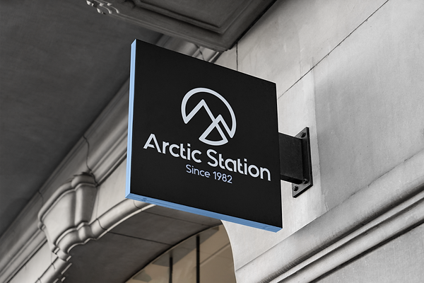
These Logo Mockups provide a practical, real-world application to test if the logo is functional on materials including signs, office supplies, clothing, and mobile devices.


bottom of page